Maison Pichon Uzès Louis XVI Hand-Glazed Ceramic Dinner Plates (Set of 4)
$245
6,000+ products IN STOCK and DELIVERED in 3-6 days
6,000+ products IN STOCK and DELIVERED in 3-6 days



As Frieze London kicks off, the renowned creative director and food artist, Imogen Kwok, shares her design-led tips for serving food according to ABASK’s four style pillars. Imogen Kwok, the Sydney-born, New York-bred, London-based creative and food artist, is a master at storytelling on a plate. She creates delicious, visually compelling feasts which are as joyful to eat as they are to look at.
I always like to think out of the box, and while I want to create something that tastes good, I also want people to sit up and be challenged (in a good way!) by what they have in front of them.
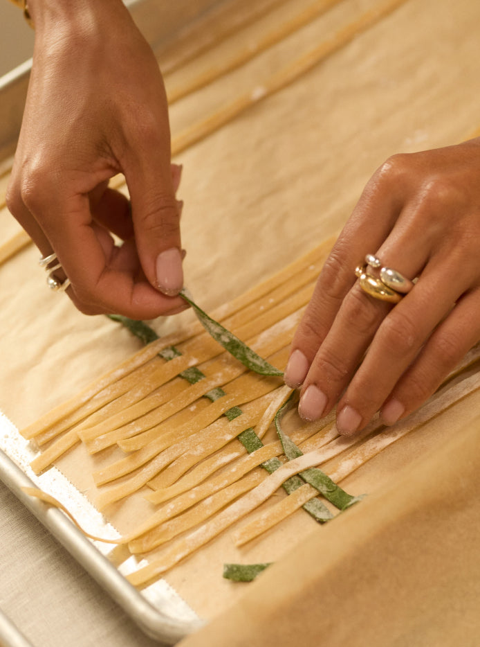
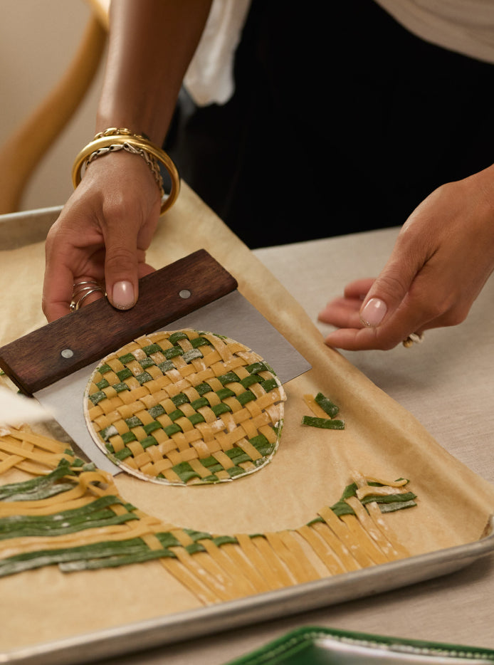
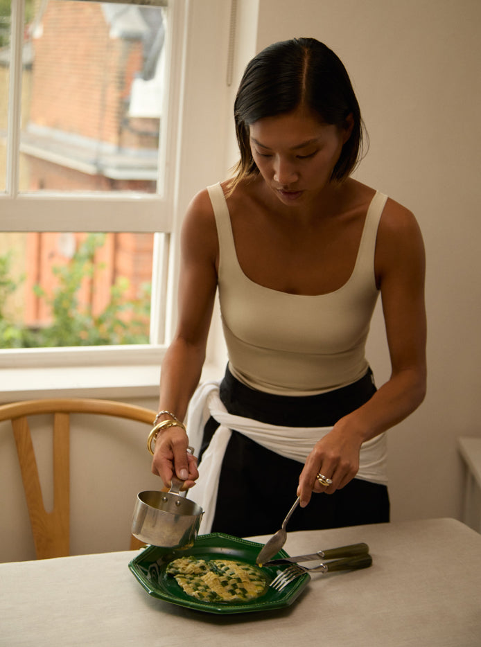
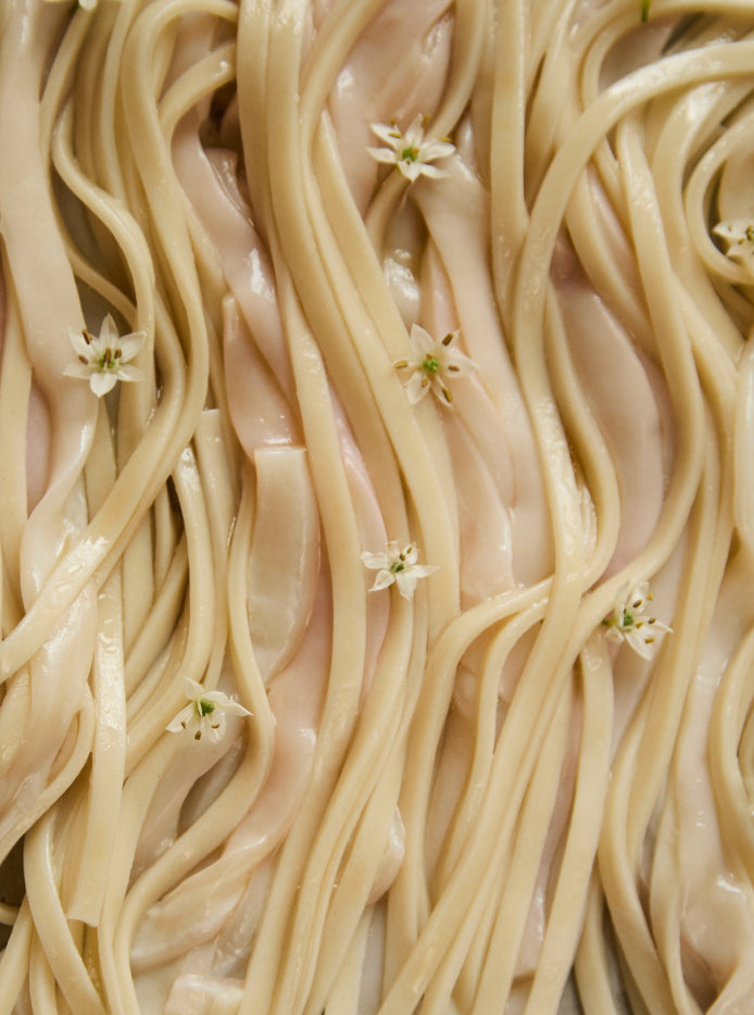
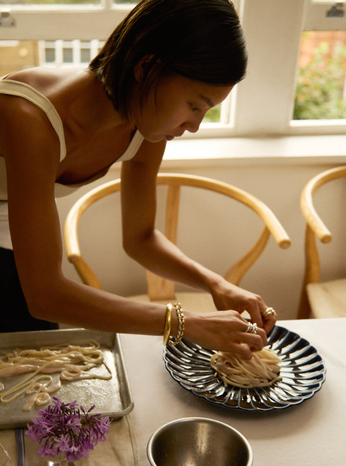
Modernism for me is sleek, clean lines and no embellishment; it’s form and function, color-blocking and verticality, and that’s how the idea for the pasta came together. It was also inspired by the French atelier, Maison Pichon Uzès, where objects are made by an eighth-generation artisan. The workshop is famous for its intricately braided baskets—the ‘corbeille’ technique—and I thought it would be fun to weave the pasta so that it speaks to the provenance of the plate, but in a way that also felt quite modernist.
I like things to be mismatched, so the pasta is not woven in alternate colors, but takes a slightly random couple of strands of green tagliatelle to one white. It’s a feeling—I don’t want things to look too perfect.
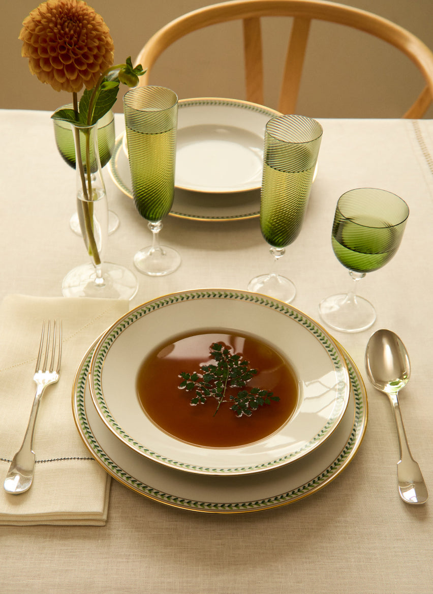
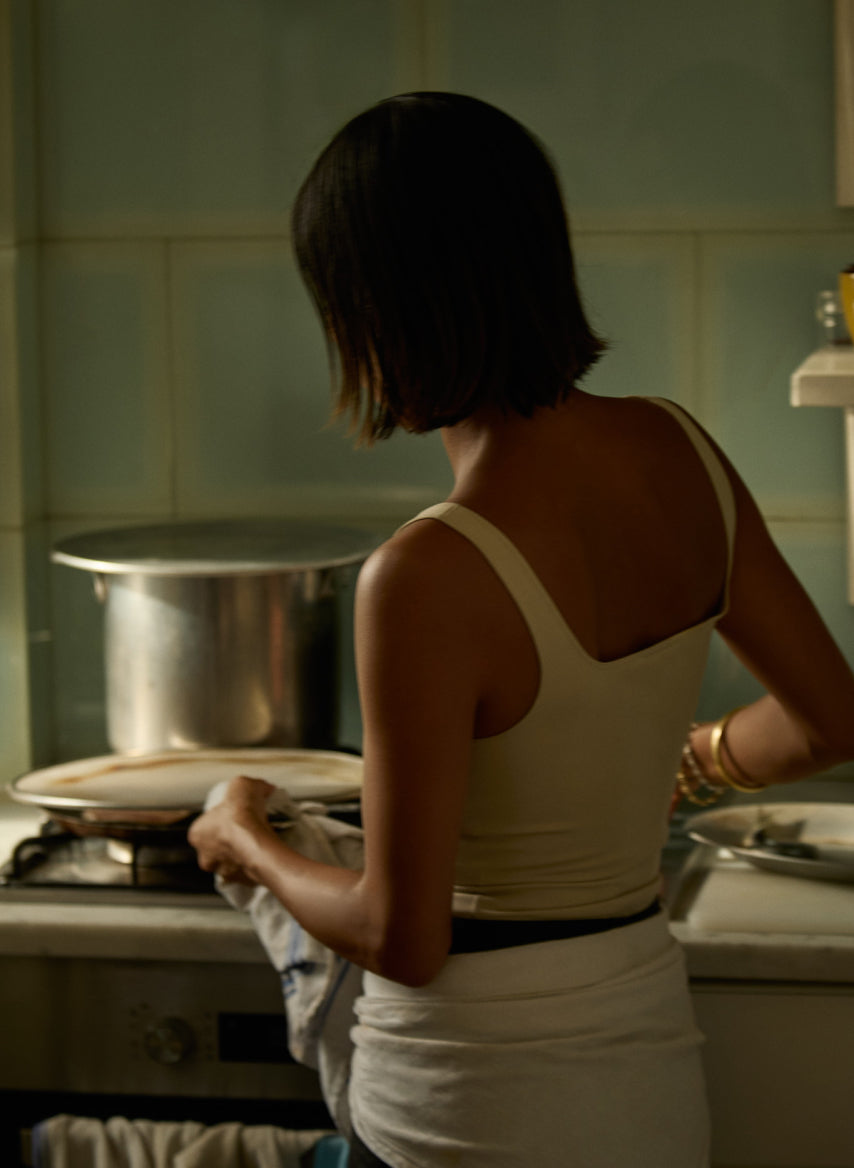
You don’t get more classic than a consommé! This takes a long time if you make it properly according to the traditional French way—a foundation technique that everyone learns at culinary school.
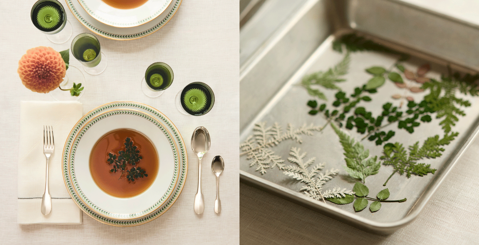
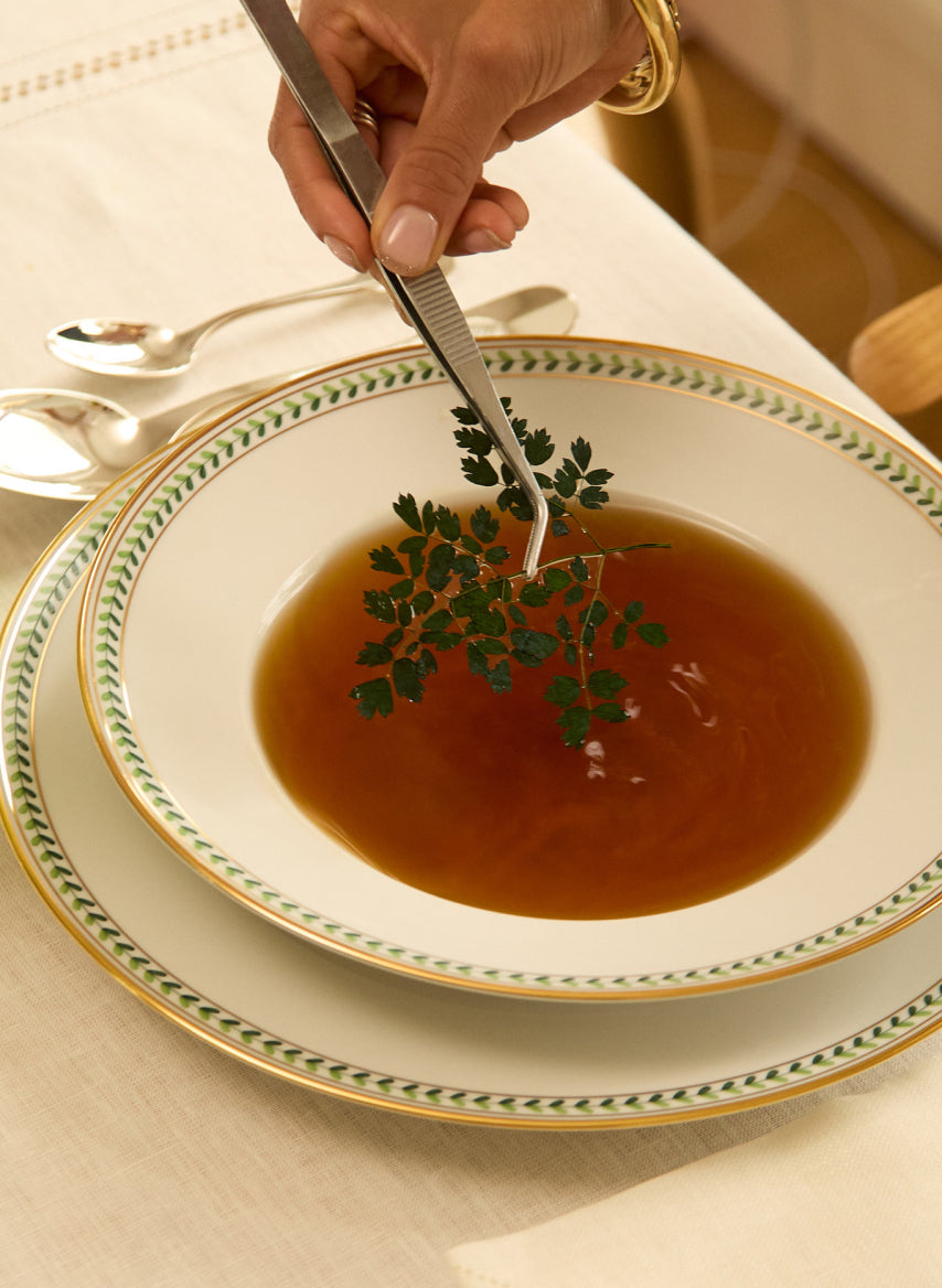
It’s the start of autumn and I wanted this to feel seasonal. The ornamental detail on the rim of this Augarten soup bowl informed an idea that I had for a garnish. I do think it’s important to include a garnish, as it makes a dish look lively, fresh and a little bit different.
A single pressed leaf also felt in keeping with my pared-back aesthetic, so overall it looks clean, focuses the mind, and forces you to look at just one thing. A tip is that if you are buying herbs, always buy a pot rather than anything out of a bag. These leaves have a spring-y-ness to them: they are a different shape, they fall differently and add volume to a salad—they are just that more bouncy.
The vogue for tablescapes and food is exuberant currently, but I think there’s a lot to be gained from exercising restraint.



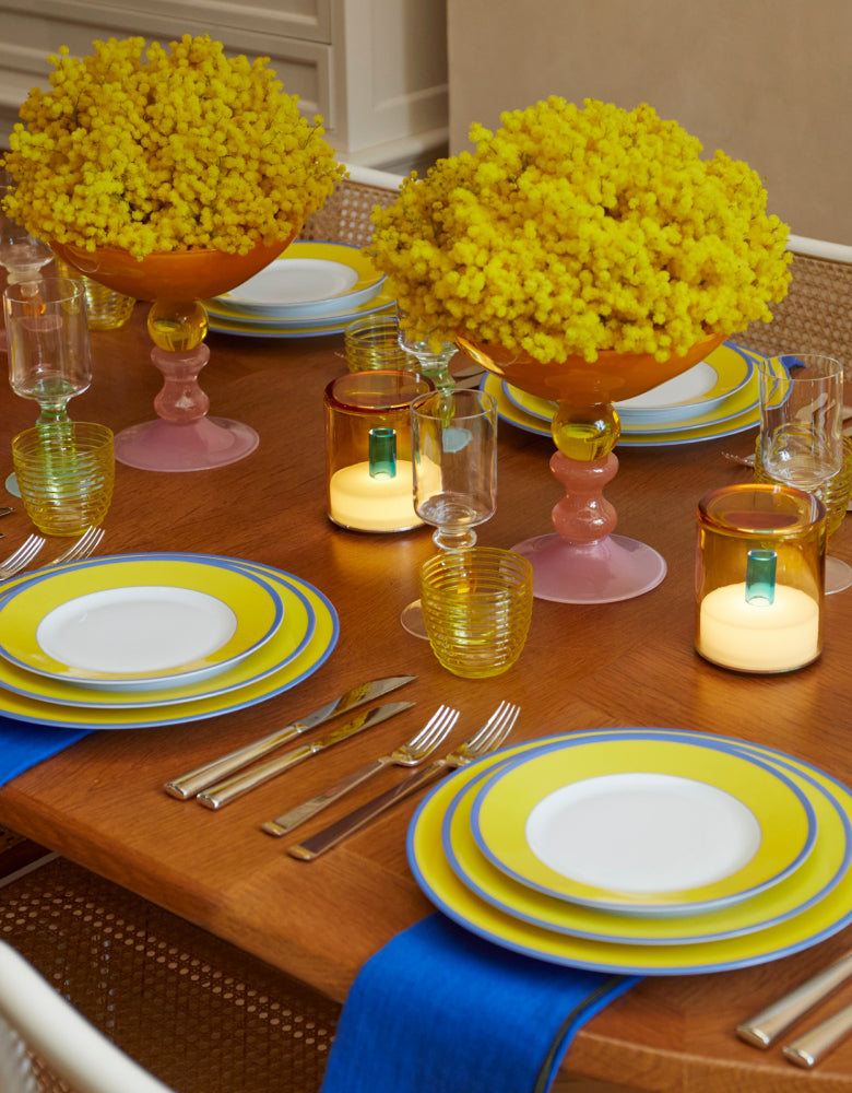
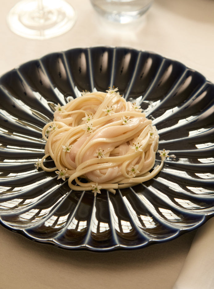
Bohemian isn’t usually my comfort zone, so my interpretation is more pulled back. But it was fun, and this dish contains a combination of things you wouldn’t expect that was a bit off-piste. It was interesting to riff on trompe-l’oeil—something I’m known for. The squid when you cut it into ribbons looks very similar to the udon noodles in thickness and in length when combined, but they are two very different textures and flavours.
To look at, it sort of resembles hair, which is loose, ethereal and relaxed. I added garlic flowers too, which make you think of daisy flowers in your hair.
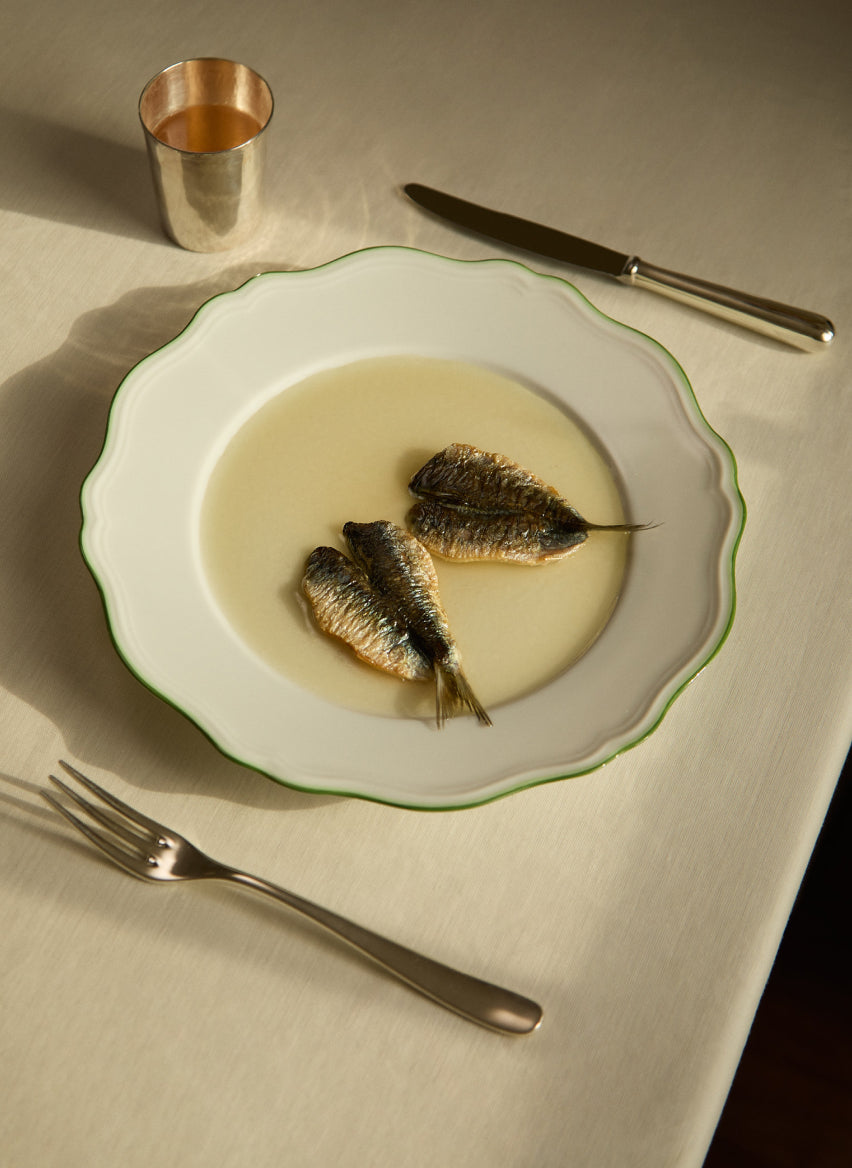
My work is very minimal, and I like things that are seamlessly arranged. When I was putting this together and thinking how I wanted this to look, I liked the idea of highlighting the silver—the cup and the cutlery, for example—and its gleam. It felt impactful to have those two shiny fish, and then allow them to breathe by using negative space, of which I’m a strong believer. I don’t like to overcrowd a plate or pile things up too high! While the sauce takes up a lot of the dish, it allows the other elements to really stand out.

Spend $300 more to enjoy free delivery
Your Shopping Bag is currently empty